


PROJECT:
Microbiome Test Registration
B2B · Healthcare · Research-led Design
Context
Salient Bio is a UK-based biotechnology company, providing microbiome diagnostics through health practitioners. Patients receive test kits from their doctor and must register them online before taking the test. The existing registration form was long and confusing, causing patients to drop off, skip important questions, and decline consent to share their data for research. Only 50% of users consented, and average completion time was nine minutes on mobile. Salient Bio commissioned a redesign of the experience to improve completion rates, increase research consent, and ensure the registration process reflected the quality of their service.
My role
Product designer in a team of six, working across a six-week project. We shared project leadership on a rotating basis and made design decisions together. As the team had varied levels of design experience and was new to Figma, I ran sessions on auto-layout and reusable components so we could all iterate quickly when usability testing results required changes. I conducted the design audit, usability testing, facilitated ideation sessions, built prototypes from low-fidelity through to the final solution, and was one of three team members who presented the research findings and justified design decisions and the final solution to Salient Bio.
Impact
Identified key friction points causing user hesitation and incomplete submissions
Increased clarity and trust signals, optimised workflow
45% faster task completion. 100% research consent (up from ~50%). 4.8/5 ease of use score.
Discovery findings
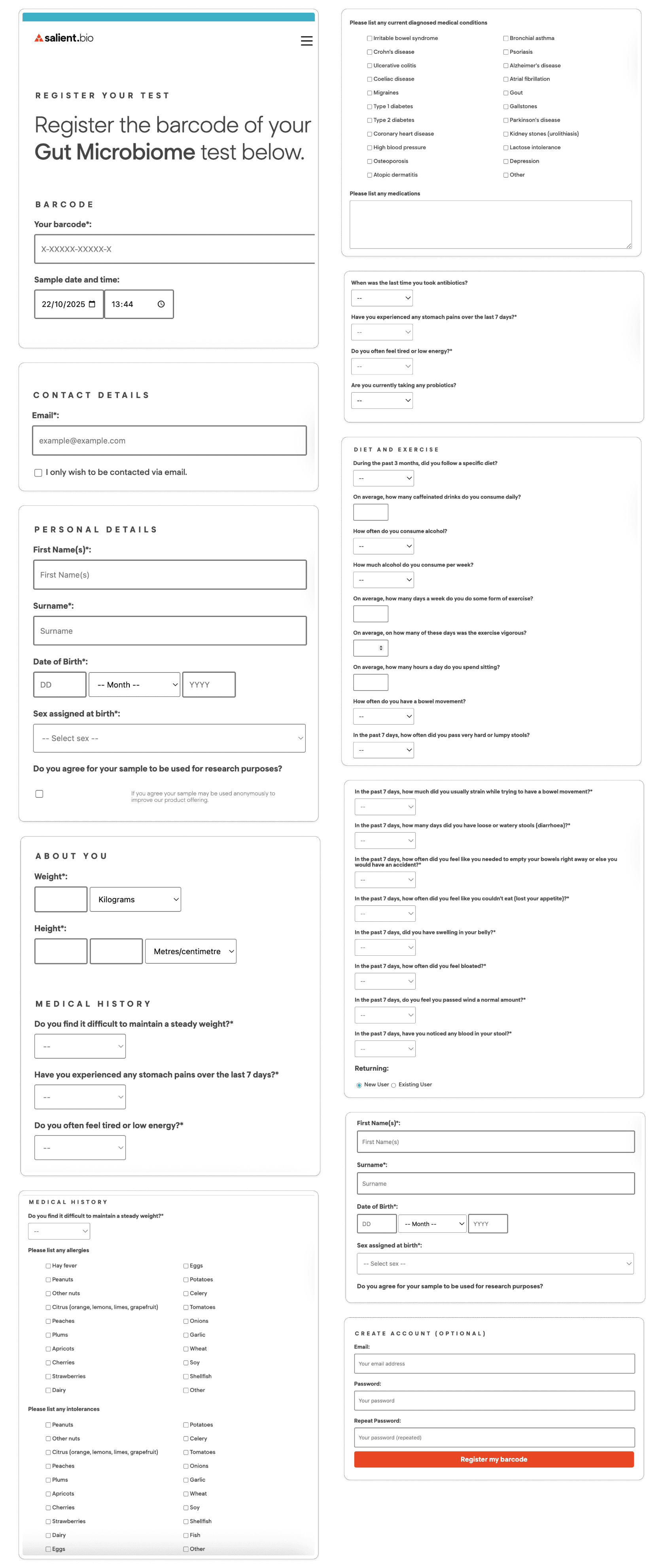
Patients struggle to complete the test registration because the form is long, unclear, and not mobile-responsive, with ambiguous questions and no explanation of why data is being collected.
This leads to drop-off, incomplete submissions, reduced data quality, limited research participation, and a poor first impression of both the laboratory and the referring practitioner.

Design Solution
To explore a wide range of possible solutions, each team member independently produced low-fidelity concepts for the registration flow. We then reviewed the ideas together, discussed trade-offs, and justified decisions against user needs and project goals before selecting and combining the strongest approaches into a shared direction.
Design Direction
Multi-step flow
Breaks the form into manageable, clearer categories and sections
Qs wording + hints
Reduces ambiguity and supports faster decision-making
Progress-tracking
Helps users understand where they are and what's left
Mobile-first
Designed for mobile contexts, adapting for desktop
Revised input types
Intuitive answer completion and consistency throughout
Accessibility
Font size, tap targets and scrolling to support accessibility for all
Prototype
Using the agreed principles, we created a mid-fidelity prototype to validate the end-to-end patient journey. The flow introduced a multi-step structure, early email verification, clearer input types, and progress visibility, with a strong focus on mobile-first completion and accessibility.
Prototype steps

Detailed prototype with and without consent

Validation: usability testing
We tested the first prototype with 8 participants to assess ease of use, clarity, and overall confidence during registration. Testing focused on key tasks across the journey helped us identify where assumptions did not align with real user behaviour.


Positive findings
4.8/5
Overall ease of use
100%
Consent for research
45%
Faster completion
Clean & easy to use
“It feels clean and simple”
Logical flow
Users felt the new structure was easy to follow
Question group length
Number of questions per step was just right
Answer format
Users selected answers more quickly with less hesitation
Question hints
Hints significantly reduced the time people had think to answer
Save option
Gave users confidence they wouldn’t lose progress and could return later
Improvement opportunities
1
Critical
Blocks task completion
2
High
Severely disrupts the
experience
3
Medium
Creates friction or slows users
6
Low
Minor annoyance
Final solution
Based on usability findings and stakeholder feedback, we refined the design to reduce remaining friction, clarify intent, and remove unnecessary steps. The final prototype focused on a more streamlined flow, clearer confirmation states, and improved guidance where required. We also applied the lab's main website style to provide a consistent digital experience.
QR code scan on test kit booklet
A user scans the QR code provided on their test kit booklet and navigates to the registration landing page. Initially, we introduced step-by-step digital instructions to bridge the experience, but users tried to click the steps as buttons and ignored the text, creating unnecessary friction. We removed the screen entirely to keep focus on test registration.

Email verification and account creation
We introduced email verification before any sensitive data is provided. The necessity of the step was questioned by stakeholders, but it was retained as a security measure to link personal medical data to the correct email address and as a way to follow up with users who don’t complete registration. The step also created confusion with account creation at the end of the experience in the first version of the prototype, so we connected these two steps to clarify the intent.

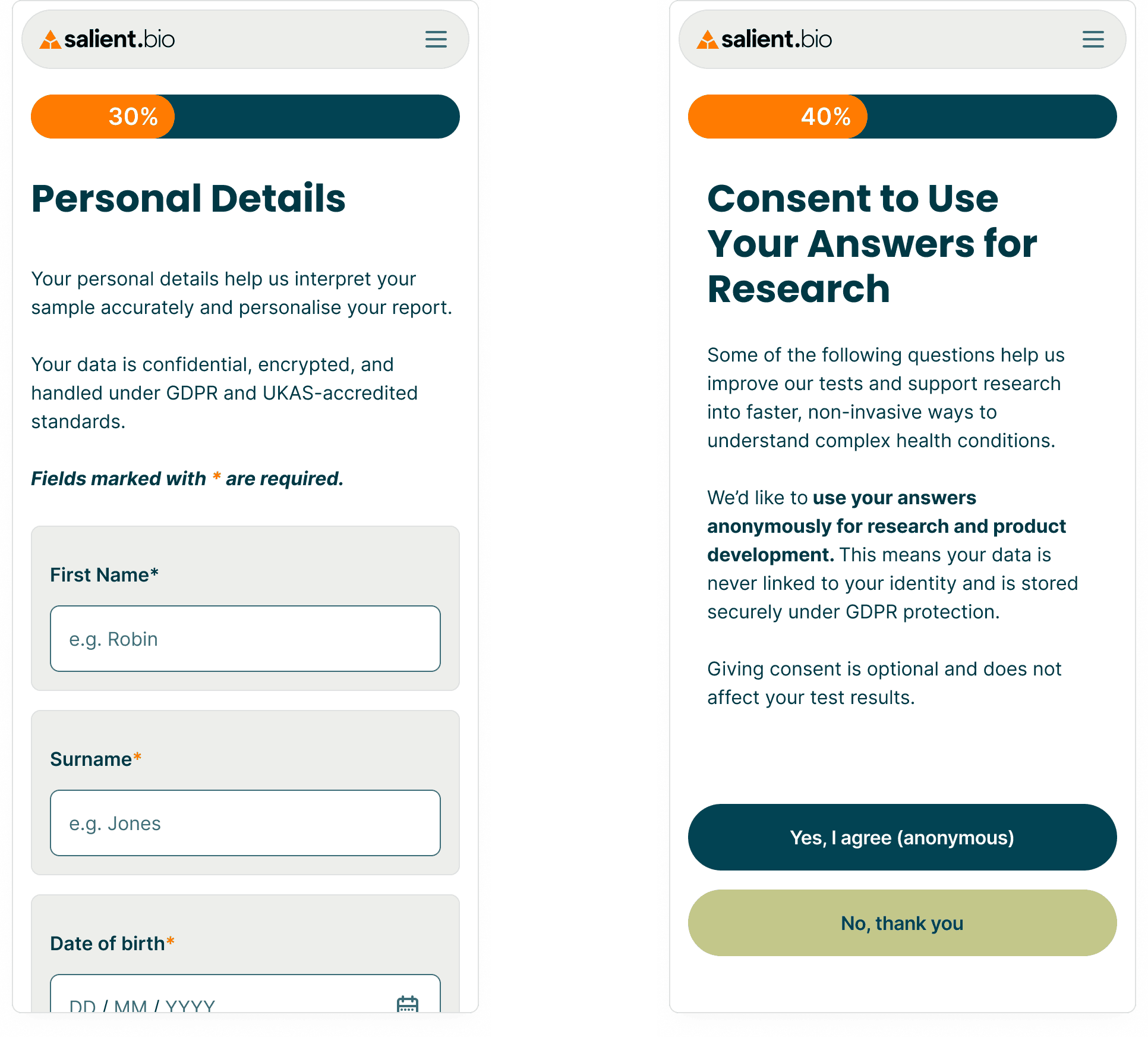
Personal details and consent page
Once the email is verified, the user can safely provide their personal information and choose whether they want to anonymously share the following medical information for the lab's research.
Medical questionnaire related to the microbiome test
When processing the lengthy medical questionnaire that did not indicate when it would end, creating a lot of impatience and frustration in users, we split it into several logical steps, making the task easier to complete. We also clarified particularly confusing questions with hints explaining how to choose answers and noticed faster question answering during the usability testing.

Confirmation of registration
In the first version of the prototype, a detailed summary of completed steps was shown on the confirmation page, but it overwhelmed users, who lost their sense of where they were and what to do next. It was replaced with a clearer confirmation and a single relevant next step to show where and how to track test progress.

Responsive design
We were primarily designing for the mobile-first experience, but keeping in mind how it would look and feel like on the desktop as well. We chose a simple responsive approach, designing our components using autolayout, so they could easily be applied to all screen sizes.
Original form
New design

Reflection
This project reinforced two things I value in my design practice. First, the power of collaborative ideation: working with other designers brought perspectives I wouldn't have reached alone, and the strongest solution came from combining viewpoints rather than relying on one person's vision. Second, having the opportunity to dedicate proper time to planned usability testing made a measurable difference: testing caught issues that looked fine on the design board but failed with real users, and measuring the impact of design changes makes the effort worth every minute spent.